
One of the first prominent uses of my recently released Proxima Nova is at Joyent.com where it is part of their corporate identity. Notice they are using the alternate lowercase a.
(Thanks to Stephen Coles for telling me about this.)
Total results: 19.
One of the first prominent uses of my recently released Proxima Nova is at Joyent.com where it is part of their corporate identity. Notice they are using the alternate lowercase a.
(Thanks to Stephen Coles for telling me about this.)
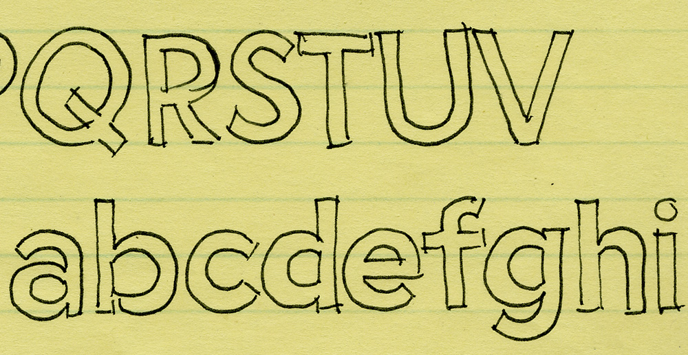
I’ve been working on this font family for almost 25 years. Here’s an early sketch (possibly the first one) from 1981:
Here’s Proxima Nova Bold for comparison:
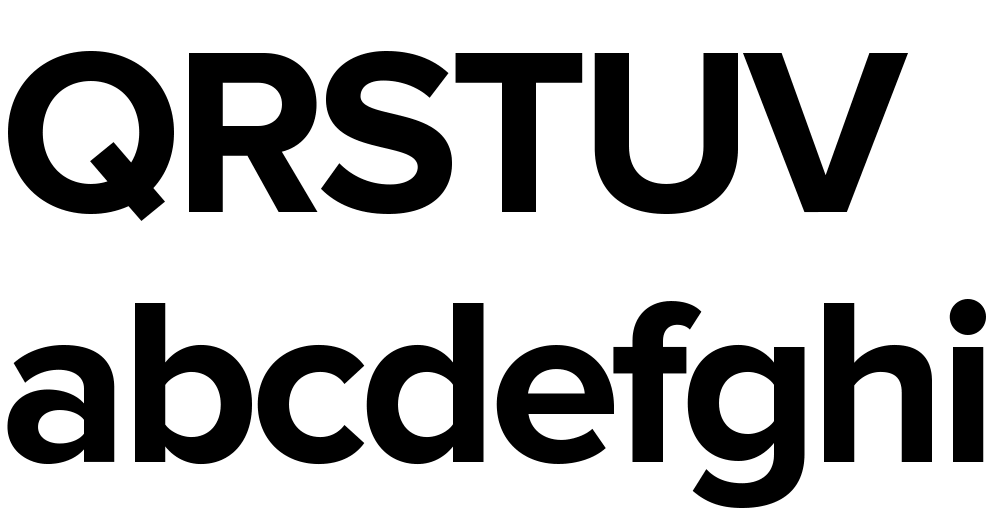
The caps are a bit different from the early concept sketch (they started out with proportions more like Futura), but my concept for the lowercase has remained virtually the same all these years.
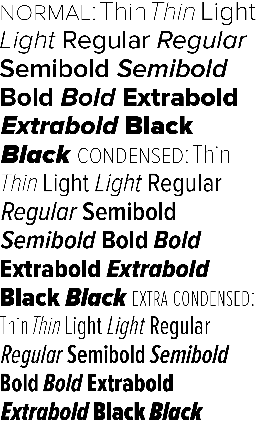
Proxima Sans (released in 1994) was my first attempt to realize that concept, and one of the first major fonts I developed. Proxima Nova, just released today, has ten years more thinking and experience behind it. It also fulfills many of the plans and ideas I had for Proxima Sans—small caps, wider range of weights and styles (including Condensed and Extra Condensed), and things I never dreamed of, like extended language support and UniCode.
If you want to know more about this new family of fonts, here are some links:
There is also a comprehensive 93-page PDF sample book. I split it into two parts in case you just want to look at the overview (the first part):
Proxima Nova Overview This nine-page introduction has complete information about the fonts with one-line display samples and a page of text samples. (420k PDF)
Proxima Nova Full Specimen This 84-page comprehensive specimen devotes two pages to each of the 42 Proxima Nova fonts—one with display showings and one with text samples and complete character set. You might want to make sure your printer has enough paper before printing this out. (2.2mb PDF)
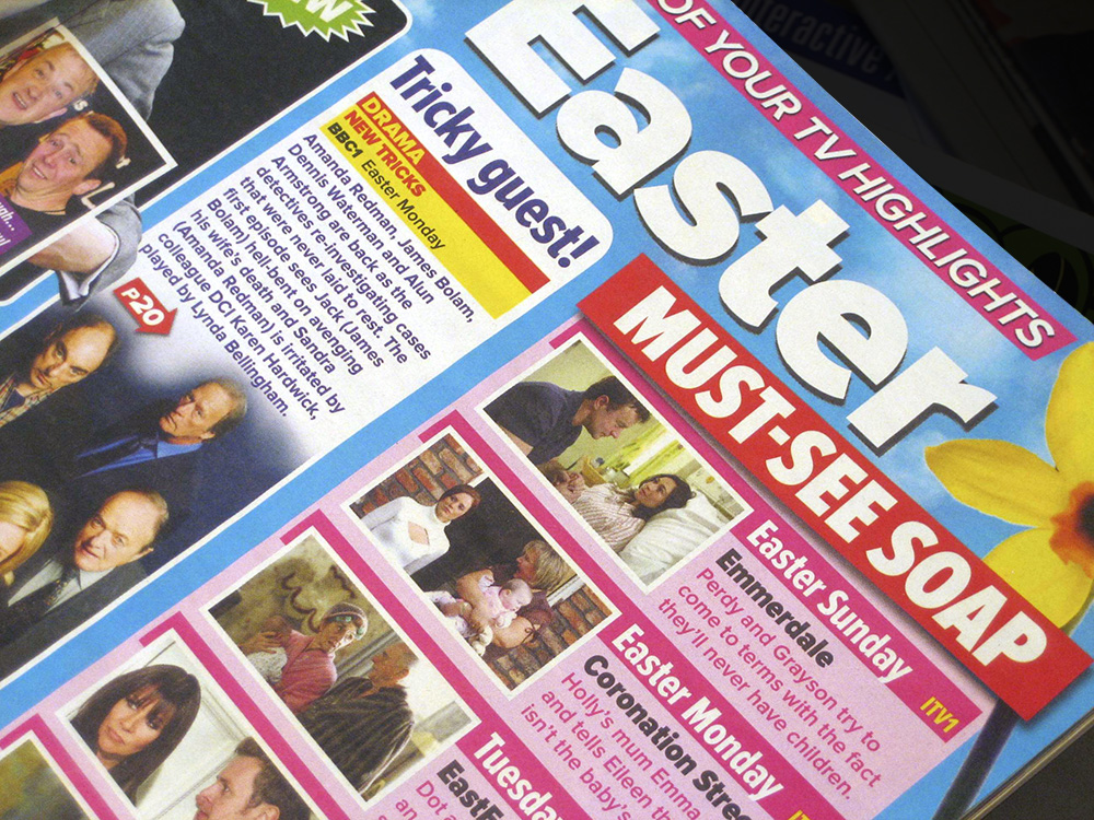
The 42 members of the Proxima Nova family get a real work out in What’s On TV, the best selling magazine in the UK. Virtually all the type in the magazine is set in Proxima Nova, from the headlines on the cover to the tiny, densely-packed text in the radio and tv listings section. It’s all part of a recent redesign of the magazine, and, according to one of the designers, the reaction from readers has been positive. The magazine also requested a new weight—halfway between Regular and Semibold—which I may release to the public at some point.

Proxima Nova version 2.008 is a major update. I’m in the process of getting it out to my distributors and it should be available from all of them within a couple of weeks.
New styles
Proxima Nova Medium. This is a new weight, available for all widths and styles. It sits between Regular and Semibold. It actually goes back to 2006, less than a year after Proxima Nova’s initial release. It was a custom weight requested by a UK magazine publisher. I’ve finally decided to officially invite it into the family.

For customers who have licensed an “all weights” or “complete” package, you should automatically get the new Medium styles when they become available at your vendor. The addition of Medium increases the size of the Proxima Nova family to 48 fonts in eight weights. Because of this, the prices of the “all weights” and “complete” packages will go up a bit accordingly.
New glyphs

Design changes
Making design changes to an existing and widely used font is not something I take lightly. That said, there were a couple of things I felt I had to change.

First, I slightly shortened the stroke at the top of the lowercase f to eliminate the need for ligatures. Unlike some fonts, the ligatures in Proxima Nova don't connect in any way. Instead, they substitute an alternate f with a slightly shorter stroke at the top to avoid colliding with the i and l. Unfortunately, it is frequently the case that ligatures are not used when fonts are used on the web, and it really bothers me. But rather than try to get everyone to fix their websites, I decided it would be simpler to fix my admittedly problematic design of the f and use the alternate f instead, eliminating the need for ligatures entirely.
Second, I slightly shortened the tail of the lowercase j for similar reasons.
Both of these are cases where the me of today wonders what the me of yesterday was thinking. But they are subtle changes, I hope, and I hesitate to even call attention to them in case someone somewhere prefers the old f or j. I expect most won’t even notice the difference, and Proxima Nova will simply look nicer more of the time.
Other improvements
Specimens
You can see the new fonts in more detail in the updated downloadable Proxima Nova specimens:
Proxima Nova Overview. The story of Proxima Nova, basic style showings, full character set and technical information. 12 pages. 622 KB PDF.
Proxima Nova Full Specimen. The overview, plus complete text and display specimen for all styles of Proxima Nova, including the full character sets. 156 pages. 5.2 MB PDF.
Proxima Nova is now up to version 1.2 with a couple of new features:
Customers needing either of these new features who purchased Proxima Nova licenses from my site (www.ms-studio.com) may contact me at mark@marksimonson.com for a free upgrade. Please include your DigiBuy order number.
Yes, I know. I haven’t been posting a lot on Notebook lately. There’s a good reason for this: Proxima Nova. That’s what I’m tentatively calling the new improved version of my ten-year-old Proxima Sans, one of the most ambitious font projects I’ve ever undertaken. Here’s how it looks so far:
Ever since I released it in 1994, I’ve had in the back of my mind larger plans for Proxima Sans. Small caps. More weights. Condensed styles. After some potential customers asked about such possibilities early last year, I decided it was time.
The new version will have more than new weights and features. I went over every character, refining and retooling the design, adjusting, perfecting, cleaning up. In short, this is completely new set of fonts.
Proxima Sans
Released: 1994
3 weights, 2 styles
6 fonts total
PostScript Type 1, TrueType
Basic Western Latin
245 characters
Proxima Nova
To be released: Soon
7 weights, 2 styles, 3 widths
42 fonts total
OpenType
Extended Latin (including CE)
699 characters
699 characters? You read that right. Take a look:
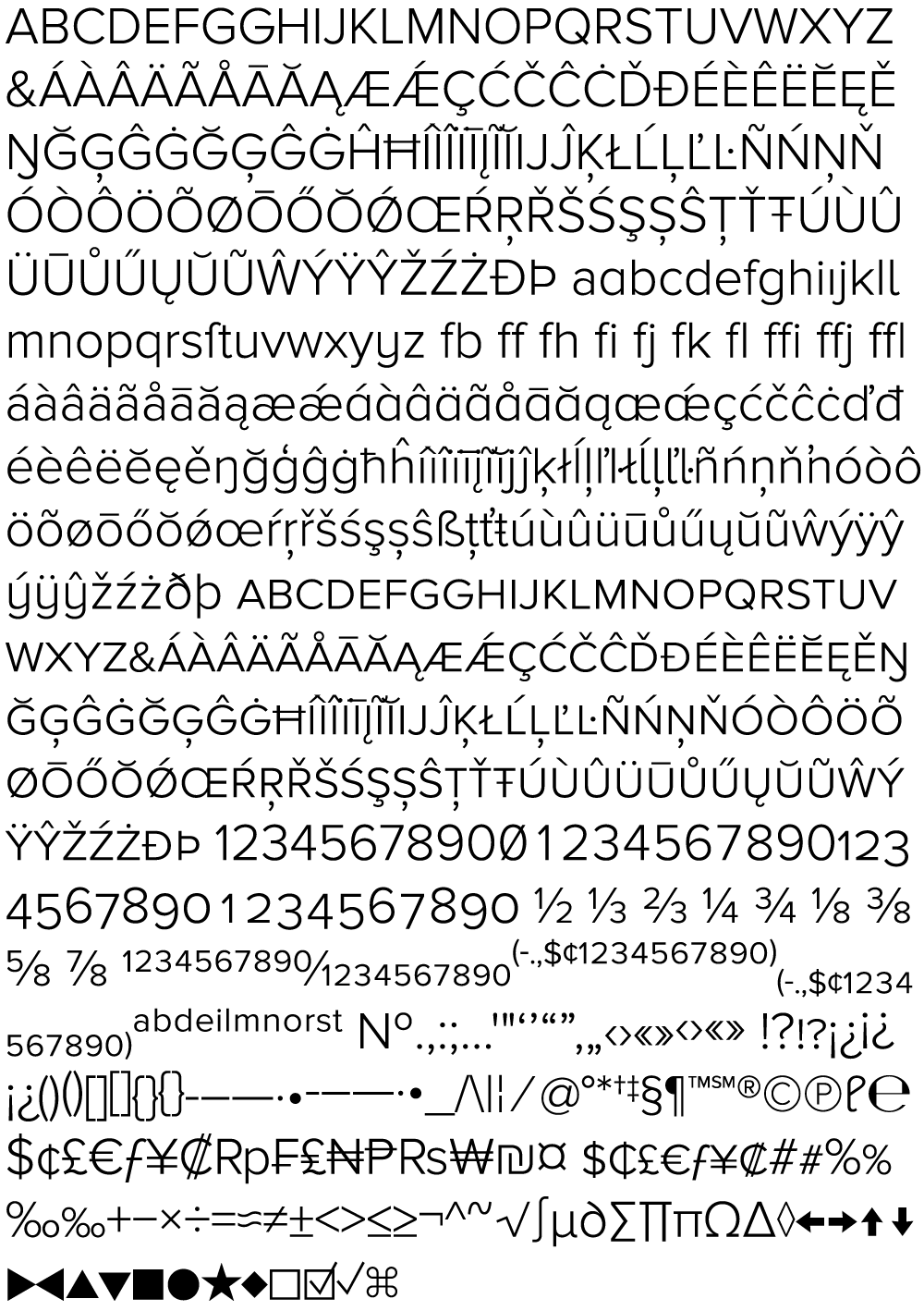
All the characters from Proxima Sans are still there (even the dingbats). But there’s loads of new stuff, and every weight has all this in it, all in one font. No separate “expert” fonts needed.
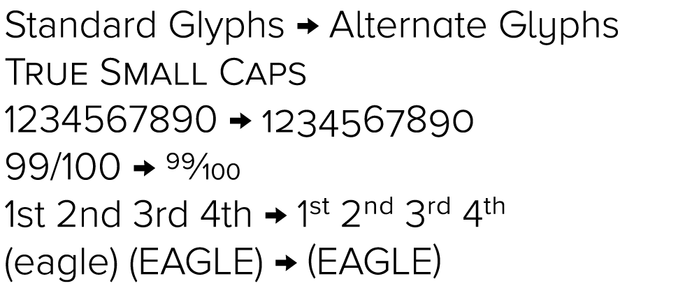
In order to keep these hundreds of characters under control, Proxima Nova will be released in OpenType format. Using popular graphics software like Adobe’s Creative Suite and (real soon now) QuarkXPress, you will be able to tap into sophisticated typographic effects such as:
As to how soon Proxima Nova will be available, it’s difficult to say. The roman styles shown here are in the final stages of completion. It mostly depends on how long it takes for me to finish the italics. Sure, I could just hit the “slant” button and be done with it. But, it’s not so simple to do it right. Best guess: Spring 2005.
6/24/05 Update: If all goes as planned, Proxima Nova will be released by the end of June 2005. I’ve updated the graphic above showing the various weights and styles to include the italics. Also, the weight and style names are slightly different than what I originally announced here in March.
6/30/05 Update: It’s available now.
Page 1 of 4